Series: GT-CP Video Tutorial
Noritake GT-CP Tutorial | Part 4: Screen Designer Example on GTOP
Table of Contents
Last update: April 26, 2019
This web-page is intended as a text supplement for the video above. This page will provide all of the necessary information (web links, images, etc.) to achieve the goals accomplished in the video tutorial.
Overview
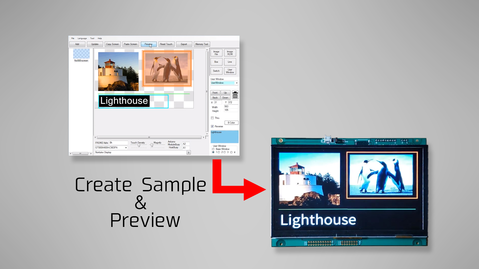
We’re going to use the GTOP’s screen designer tool, create a sample design, and preview that design on our connected GT-CP module.
Note:
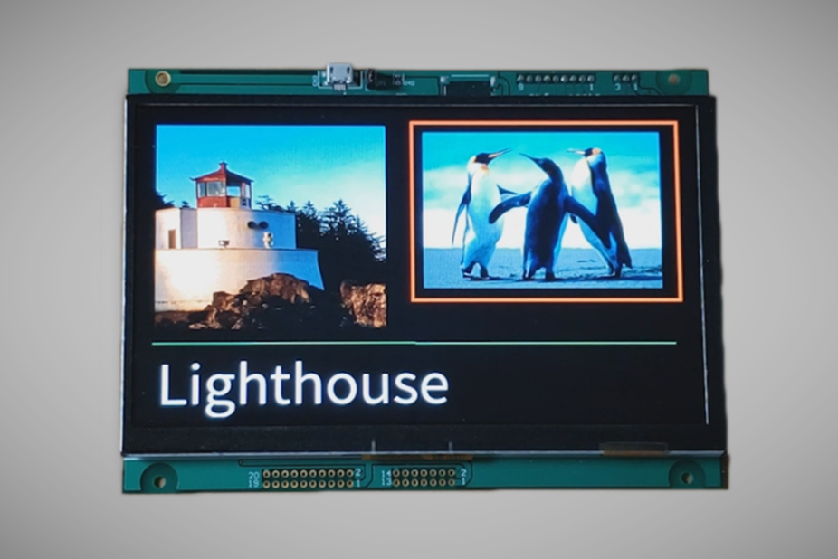
Following from part 3, we have the lighthouse.jpg image still and we’re going to use this image in our screen design.
Launch Screen Designer
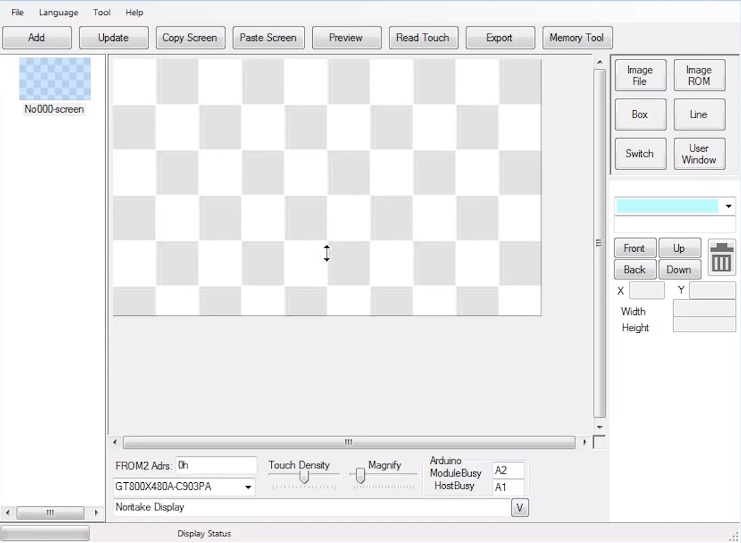
So, starting from memory tool, we’re going to transfer over to the screen designer. Go to “File” and “Exit Memory Tool” to do so.
During the transition, the tool will pass along the images that we have in our memory tree.
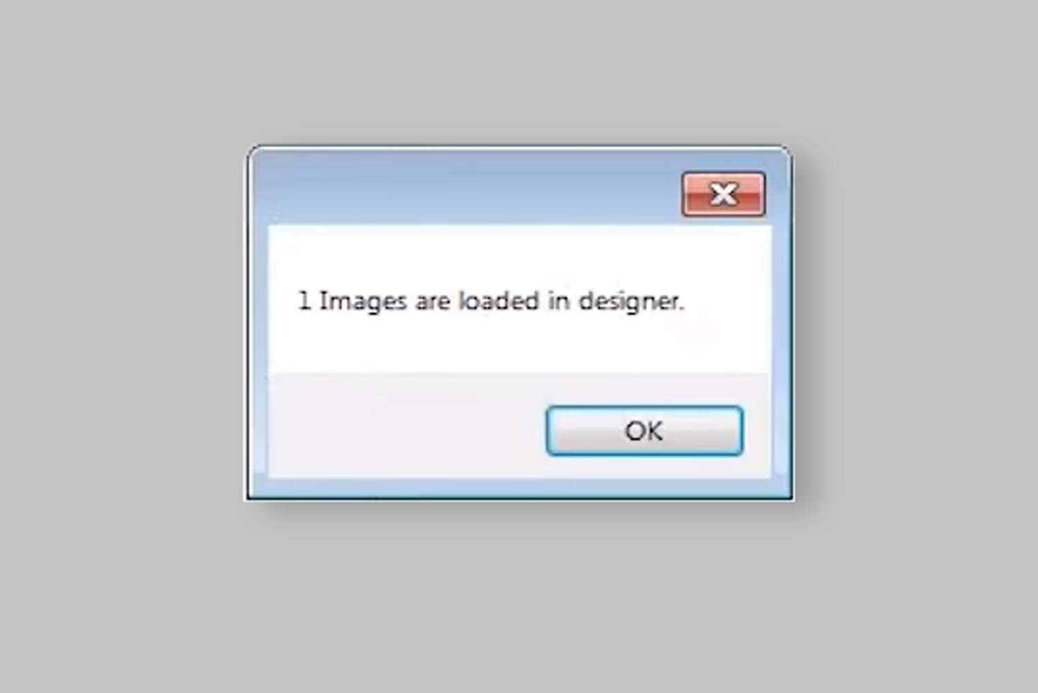
Right now, we only have one image to be loaded into the designer, so hit “OK”.
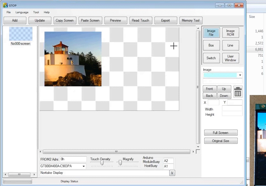
The screen design area is the checkerboard pattern rectangle in the middle of the window and the buttons on the right represent each element that we can add to this design.
Button Function
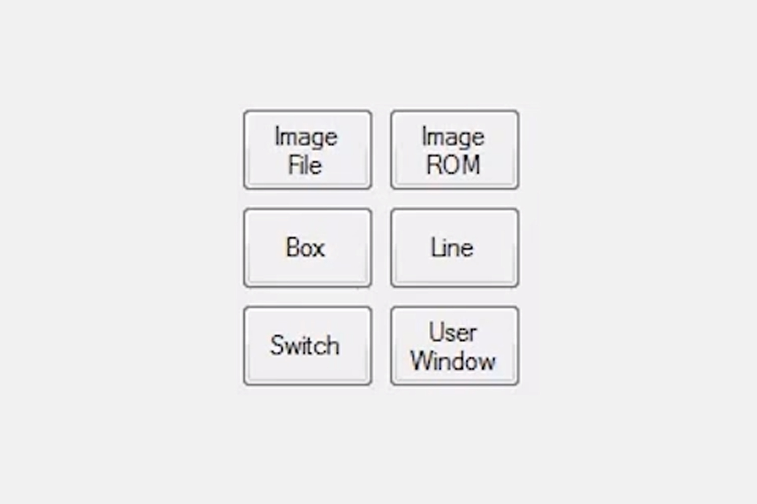
Let’s look at what we can do with each element button.
Image ROM
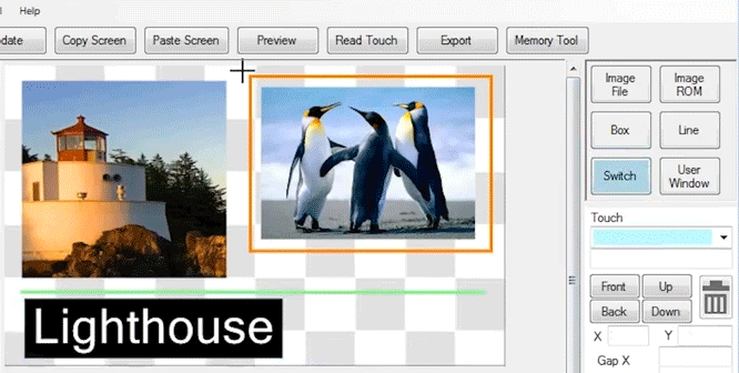
First, we’ll click on ”Image ROM” and see that our cursor has changed to a cross. Click and drag a rectangle and release. That pops up this FROM2 image selection window and all we have from FROM2 is the ”lighthouse.jpg” image.
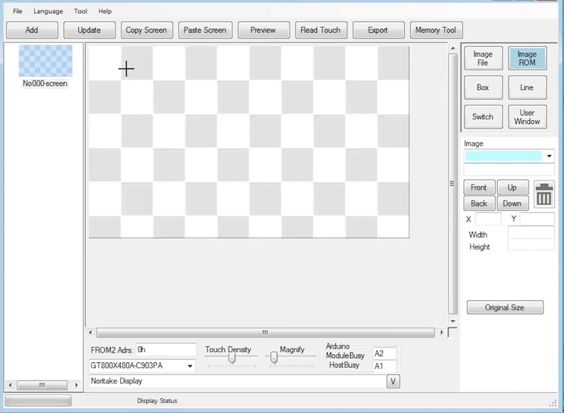
So hit “OK” and the lighthouse image appears and we can select it, move it around, and also crop it if we adjust the sides of the image.
This blue blinking outline means that this element is selected. This is true for all elements.
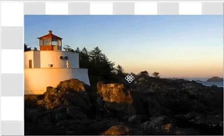
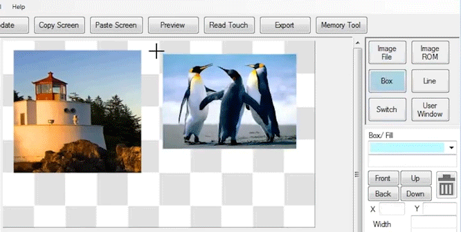
Image File
Next, we’ll choose an image file from our PC. So again, we’ll click and drag and release and now we’re greeted with an open dialog box.
I’ll choose the Penguins image. You can use any image on your PC. Hit “Open” and the Penguins image pops up.
Box
Next, we’ll draw a box around the Penguins image. Click, drag, and release.
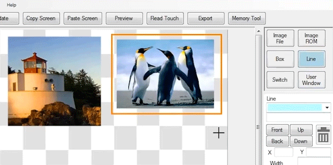
I’ll choose an orange outline. Now we have an orange box.
Line
Next, we’ll draw a line that goes across the entire screen. I’ll make that line light green.
User Window
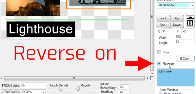
Next, we’ll create a user window, which is essentially a text box. So again, click, drag, and release. We’ll choose the text color, I’ll choose black. I’ll write in here “Lighthouse” and this text will appear when I hit “OK”. Now I have white text with a black background. That is actually the reversed setting of what we initially chose.
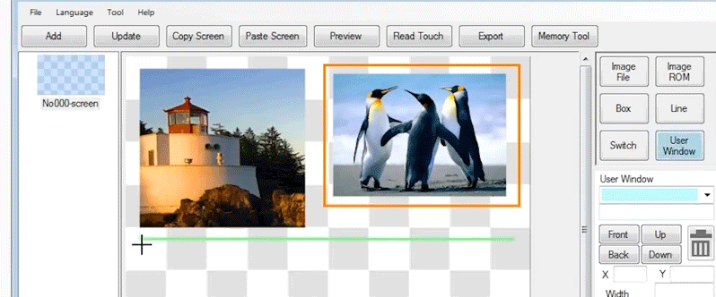
So, if I undo the reverse option we have black text and a white background and I hit reverse again and we have white text and a black background. This setting will look nicer on the display because the display already has a black background.
Switch
Lastly, we will add a switch to our screen. I’m going to add the switch over the penguin image. Same thing, click, drag, and release.
I’ll make this orange as well to match the rectangle. The resulting switch is only visible on the screen designer. When this is sent to the module, the transparent orange box will not be seen. This is useful in the designer so you know where all of your switches are.
Preview
So, now that we have all of our elements on the screen, let’s hit preview and everything should show up on the module.
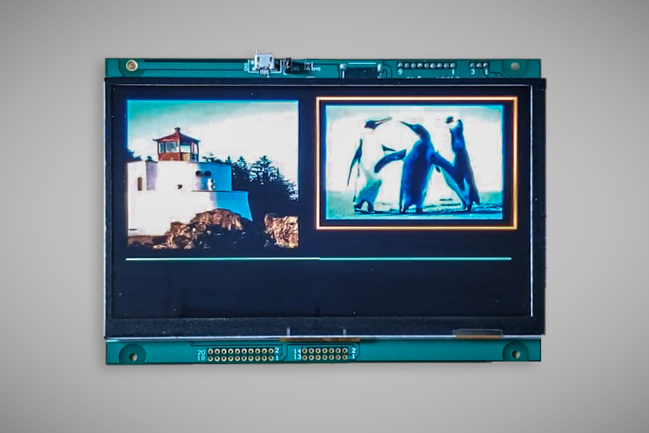
Now, the lighthouse has not shown up, so that means we need to adjust the vertical height of the lighthouse text box just a little bit for the text to actually come through.
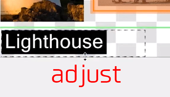
Let’s preview it again. There we go, it just needed a slight adjustment.
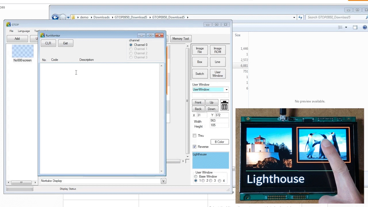
Read Touch
Hit the “Read Touch” button and this will open a touch monitor where we can test out our touch switch.
So, I’ll come over here with my finger and touch and release and touch and release and we can confirm that this touch switch actually works. This touch information is coming directly from the module to the PC.