Series: Using the GT-SP Touch Panel TFT Display with Arduino
How to Display Data Using GT-SP Graph – Part 2
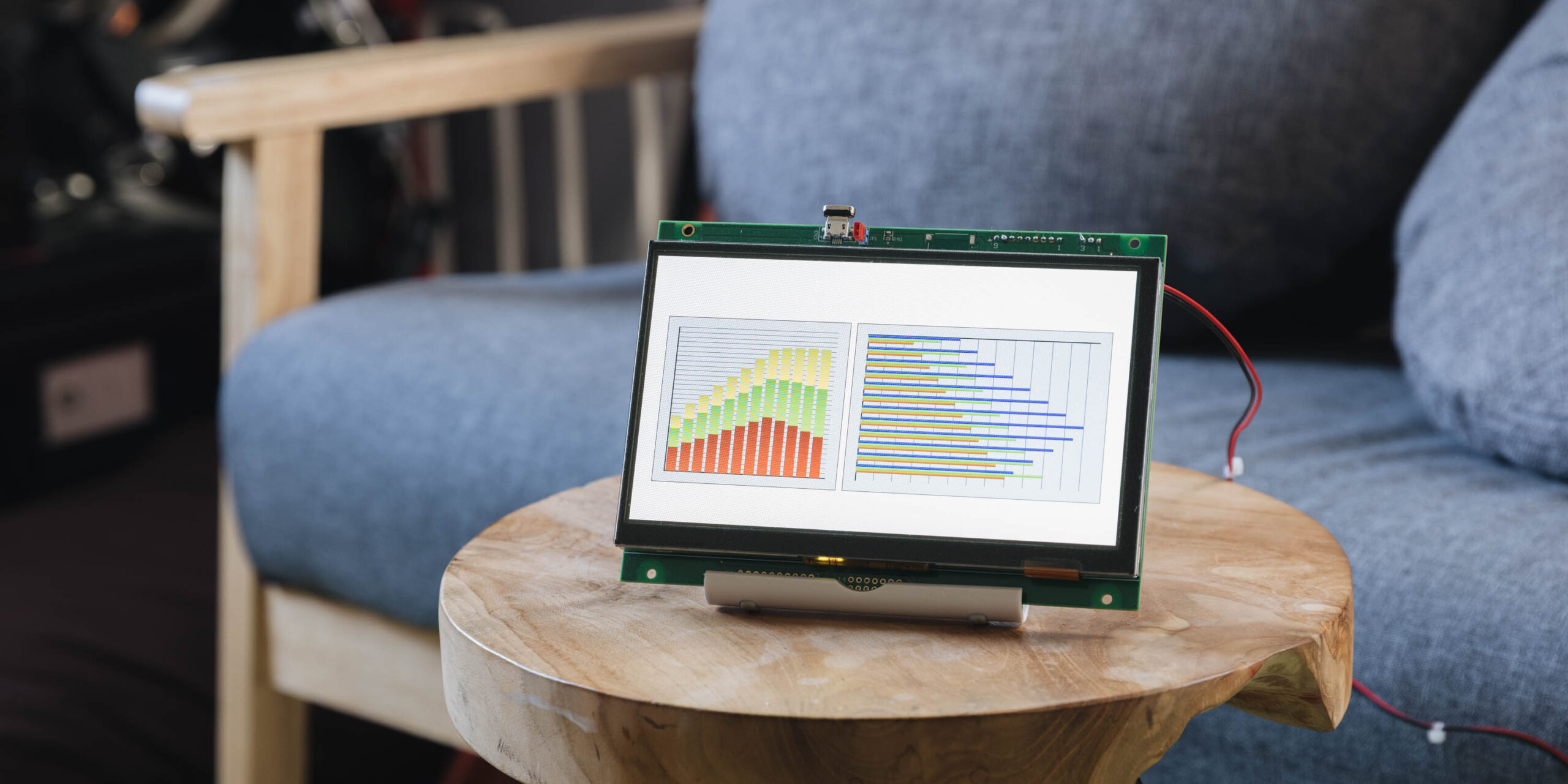
Table of Contents
DownloadDownload sample project & program (for GT Design Studio & Arduino)
Hello everyone, I’m @kissaten, a beginner in electronics. In this series, I’m explaining the process of connecting a 7-inch touch display (GT-SP series “GTWV070S3A00P”) to an Arduino and working on various projects.
In this article, we’ll use the Graph tool in GT Design Studio to create bar graphs and explore how to visually present data in a clear and intuitive way. Using production quantity data as an example, we’ll walk through how to use two types of bar graphs effectively.
Types of Bar Graphs Used
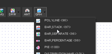
We will use the following two types of bar graphs in this article:
-
Bar Stack (Stacked Bar Graph)
-
Displays data by stacking them in a single bar
-
Useful for understanding the total trend over time
-
-
Bar Separate (Grouped Bar Graph)
-
Displays each data set as separate bars
-
Makes it easy to compare values across categories
-
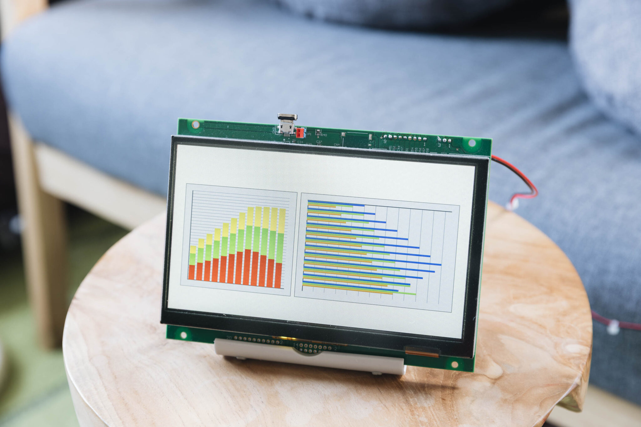
Visualizing Production Data
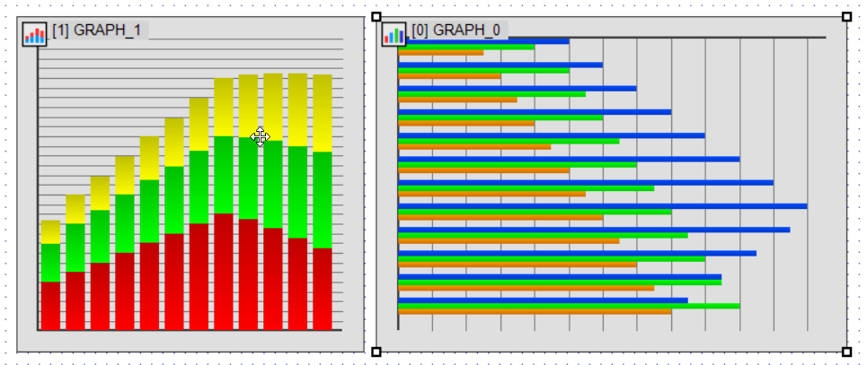
In this example, we’ll use 12 months of production data to create two types of bar graphs:
-
Bar Stack: Used to display the total production count per month by stacking the data. (Shown in the left graph)
-
Bar Separate: Used to compare the monthly trends of each product’s production count. (Shown in the right graph)
These two graphs will help us better understand and present the data visually.
Example Production Data (Unit: pieces)
- 100, 120, 140, 160, 180, 200, 220, 240, 230, 210, 190, 170 # Product A
- 80, 100, 110, 120, 130, 140, 150, 160, 170, 180, 190, 200 # Product B
- 50, 60, 70, 80, 90, 100, 110, 120, 130, 140, 150, 160 # Product C
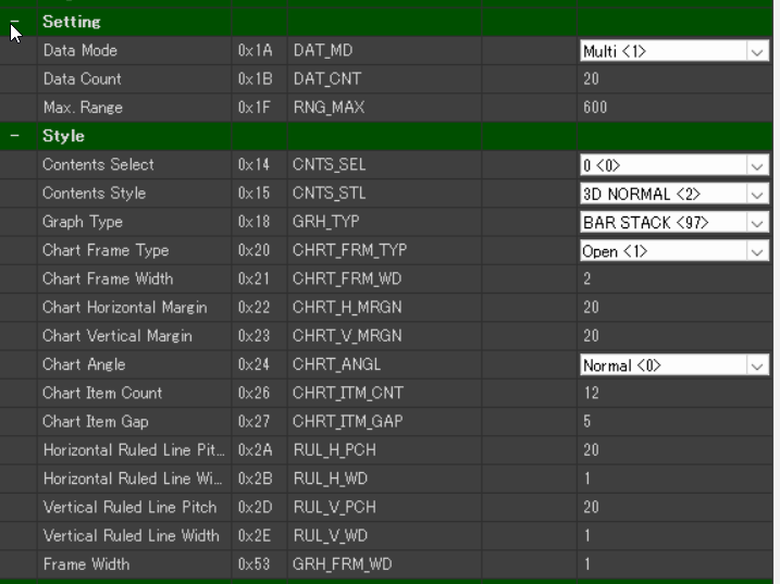
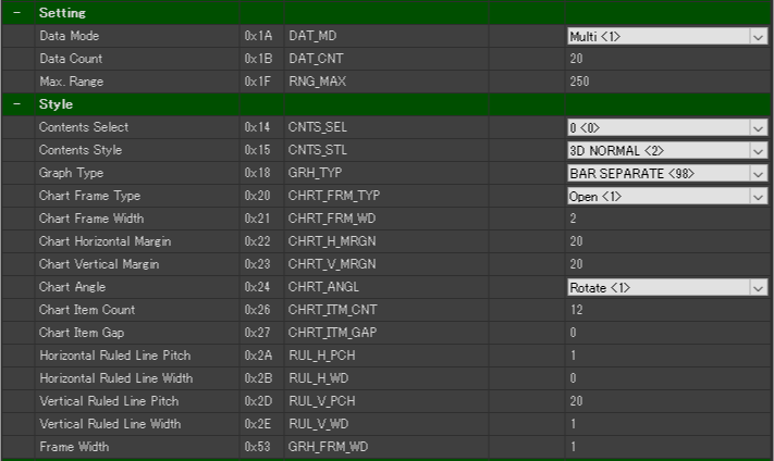
Bar Stack Settings (Stacked Display)
Let’s start by setting up the Bar Stack to visualize the total production count per month.
Configuration Items:
-
Data Mode(0x1A) → Multi <1>
-
Select Multi when displaying multiple data sets together in one graph.
-
-
Data Count(0x1B) → 20 (default)
-
Specifies the number of data points in the graph. Since we are displaying 12 months of data, this should be set to 12 or higher.
-
-
Max Range(0x1F) → 600
-
Sets the maximum value for the Y-axis. Make sure it is greater than the total production value to be displayed (in this case, 600 or more).
-
-
Chart Item Count(0x26) → 12
-
Displays data for 12 months.
-
-
Graph Type(0x18) → BAR STACK (97)
-
Selects the stacked bar graph type.
-
Bar Separate Settings (Individual Display)
Next, let’s configure Bar Separate to compare the monthly production numbers for each product individually.
Configuration Items:
-
Data Mode(0x1A) → Multi <1>
-
Data Count(0x1B) → 20 (default)
-
Max Range(0x1F) → 250
-
Chart Angle(0x24) → Rotate<1>
-
Rotates the graph to display bars horizontally.
-
-
Chart Item Count(0x26) → 12
-
Chart Item Gap(0x27) → 0
-
Removes space between bars to make them appear thicker.
-
-
Graph Type(0x18) → BAR SEPARATE (98)
-
Selects the grouped (individual) bar graph type.
-
Color Settings for Better Visibility (Bar Separate)
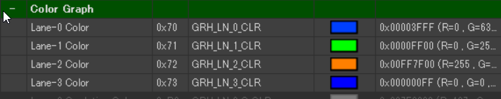
-
Lane-0 Color (Product A) → Dark Blue (#003FFF)
-
Lane-1 Color (Product B) → Light Green (#00FF00)
-
Lane-2 Color (Product C) → Orange (#FF7F00)
Enhancing Visibility with Gradation Effects
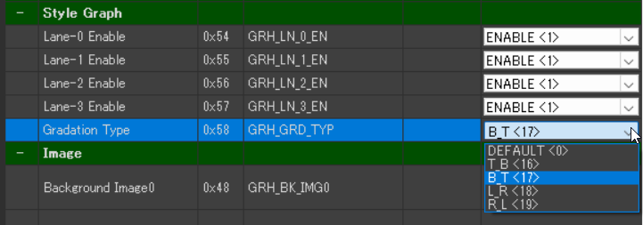
Bar Stack becomes more visually intuitive when a gradient is applied to the bars.
You can change the gradient style using the Gradation Type setting as follows:
-
Gradation Type(0x58)
-
BT(Bottom to Top) → Applies a gradient from bottom to top
-
TB(Top to Bottom) → Applies a gradient from top to bottom
-
LR(Left to Right) → Applies a gradient from left to right
-
RL(Right to Left) → Applies a gradient from right to left
-
Recommended setting for this example:
-
Bar Stack → BT (Bottom to Top)
-
This highlights the build-up from the bottom, making the stacked structure easier to understand.
-
DownloadDownload sample project & program (for GT Design Studio & Arduino)
Summary
In this article, we explored the bar graph features of Noritake GT-SP by:
-
Using Bar Stack to visualize the overall trend of production volume
-
Using Bar Separate to compare monthly production by product
The way data is presented can change significantly depending on the graph settings, so it’s important to choose the right configuration based on your specific purpose.
In the next article, we’ll look at 100% stacked bar graphs and pie charts to visualize the composition and proportion of multiple elements within a whole.