Series: Using the GT-SP Touch Panel TFT Display with Arduino
How to Display Data Using GT-SP Graph – Part 3
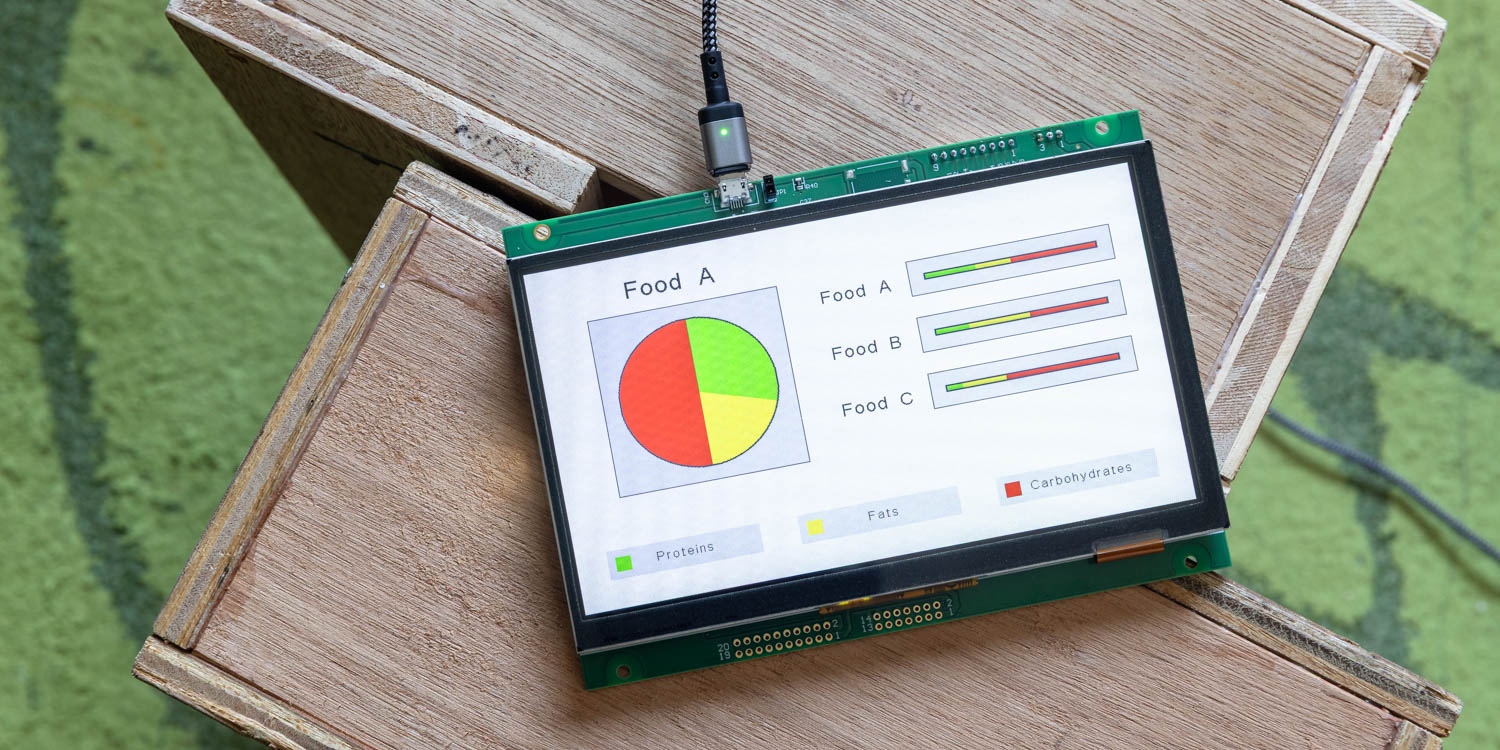
Table of Contents
DownloadDownload sample project & program (for GT Design Studio & Arduino)
Hello everyone, I’m @kissaten, a beginner in electronics. In this series, I’m explaining the process of connecting a 7-inch touch display (GT-SP series “GTWV070S3A00P”) to an Arduino and working on various projects.
This time, I will introduce how to use the Graph tool in GT Design Studio to create pie charts and 100% stacked bar graphs, presenting data in a clear and visual manner. Using the nutritional composition ratio (PFC balance) of food as an example, I will explain how to utilize two types of graphs.
Types of Graphs Used
Types of Graphs Used
-
PIE (Pie Chart)
-
Allows intuitive understanding of the proportion of each element in the whole
-
Suitable for displaying the ratio of single data composed of a small number of items
-
-
BAR_PERCENTAGE (100% Stacked Bar Graph)
-
Allows easy comparison of proportion differences across multiple datasets
-
Enables horizontal visual comparison of the composition ratio of each item
-
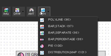
From the toolbar in GT Design Studio, select “GRH > GRAPH” and choose the desired graph type.
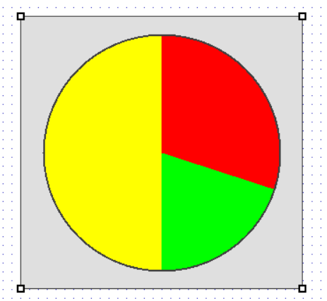
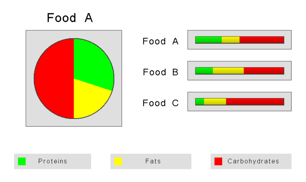
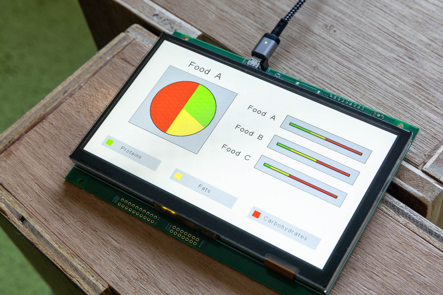
Displaying PFC Ratio of Food A Using a Pie Chart
First, let’s display the ratio of protein, fat, and carbohydrate in one type of food (Food A) using a pie chart.
The following PFC ratio data is used for this example:
PFC Ratio Data of Food A (Unit: %):
| Nutrient | Ratio |
|---|---|
| Protein | 30% |
| Fat | 20% |
| Carbohydrate | 50% |
- 30, 20, 50 # PFC ratio of Food A
Place a GRH object and set the Type to “PIE” (Type No. 100). Input the PFC ratio data of Food A in Lane-0 Data (Address 0x40).

This displays the PFC balance of Food A as a pie chart.
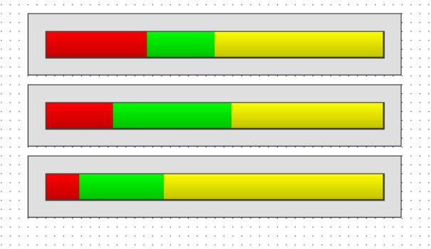
Comparing PFC Ratios of Multiple Foods Using a 100% Stacked Bar Graph
Next, create a 100% stacked bar graph to compare the PFC ratios of three types of foods: Food A, Food B, and Food C.
The following PFC ratio data is used:
PFC Ratio Data Example (Unit: %):
|
Food |
Protein |
Fat |
Carbohydrate |
|
Food A |
30% | 20% | 50% |
|
Food B |
20% | 35% | 45% |
|
Food C |
10% | 25% | 65% |
- 30, 20, 50 # Food A
- 20, 35, 45 # Food B
- 10, 25, 65 # Food C
Place three GRH objects and set the Type to “BAR_PERCENTAGE” (Type No. 103). Input the PFC ratio data of Food A to C into each object’s Lane-0 Data (Address 0x40).
This displays the PFC composition ratios of the three foods side-by-side, allowing for visual comparison.
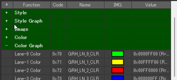
Changing Colors
GT Design Studio automatically assigns colors based on data order, but you can change the colors by setting the properties [GRH_LN_0_CLR] to [GRH_LN_13_CL
In this display, the settings are as follows:
- Lane-1: Protein -> Green
- Lane-2: Fat -> Yellow
- Lane-3: Carbohydrate -> Red
Adding Legends and Labels
Legends and labels are not displayed automatically. Using the Draw Shape Tool and Text Tool together to display them on the screen will make the graph easier to understand.
DownloadDownload sample project & program (for GT Design Studio & Arduino)
Conclusion
In this article, we introduced how to use GT-SP’s graph functions to visualize the nutritional composition ratio (PFC balance) of food.
By leveraging the characteristics of pie charts and 100% stacked bar graphs, you can not only understand individual nutritional compositions but also gain insights through comparison with other foods.
In the next article, we will link with the host computer to transition the graph display in real-time.