Series: Using the GT-SP Touch Panel TFT Display with Arduino
How to Displaying Data Using GT-SP Graph
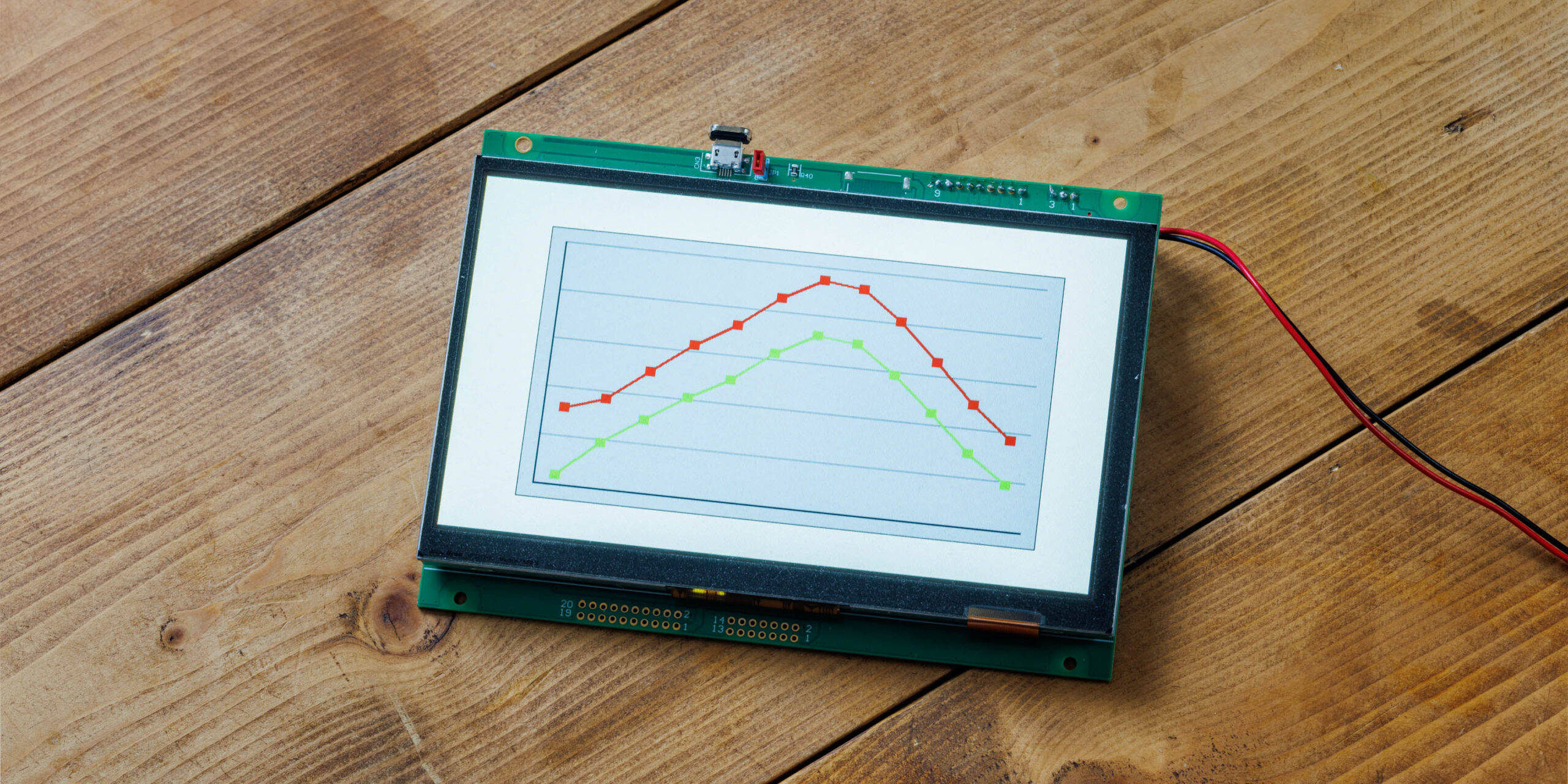
Table of Contents
DownloadDownload sample project & program (for GT Design Studio & Arduino)
Hello everyone, I’m @kissaten, a beginner in electronics. In this series, I’m explaining the process of connecting a 7-inch touch display (GT-SP series “GTWV070S3A00P”) to an Arduino and working on various projects.
In this article, we will explain how to configure graphs and input data using GT Design Studio. The GT-SP series provides dedicated properties for graph display, allowing customization of appearance and display methods by adjusting data registration and settings. We will first focus on creating a basic graph and inputting data to see how it is displayed in practice.
Visualizing Data with GT-SP Graph
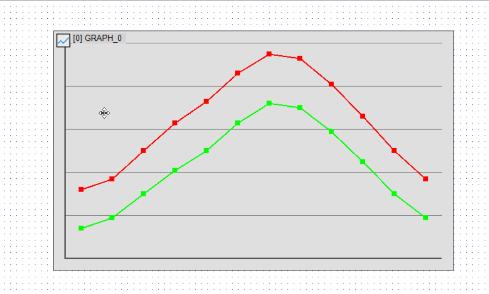
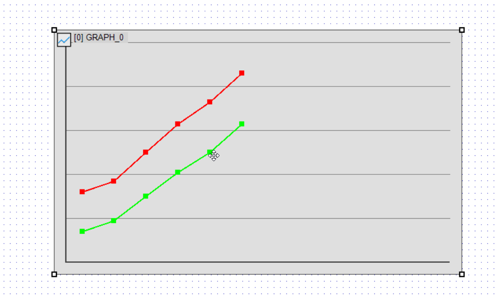
Using the GT-SP series’ graph functions (GRH), we will input actual data and display it as a polyline graph. In this example, we will use monthly temperature data to explore how data can be registered and displayed in detail.
Preparing Data
In GT-SP, data is input using comma-separated values (CSV). Below is an example of placeholder data representing monthly high and low temperatures.
32, 37, 50, 63, 73, 86, 95, 93, 81, 66, 50, 37 # High temperatures (°F)
14, 19, 30, 41, 50, 63, 72, 70, 59, 45, 30, 19 # Low temperatures (°F)
These values are registered using the GT-SP data registration properties.
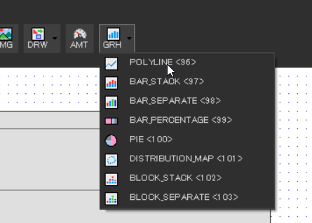
Basic Graph Configuration
In GT Design Studio, graphs are drawn using the GRH function. For this example, we will select POLYLINE as the graph type.
Setting the Data Mode
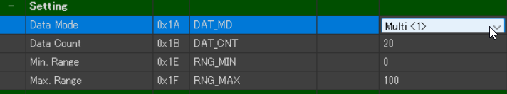
- Data Mode(0x1A) → Multi<1>
- When multiple charts need to be overlaid on a single graph, select Single Mode. To display them separately, choose Multi Mode. (Default: Single)
- Data Count (0x1B) → 20 (Default Setting)
- Specifies the number of data points displayed on a graph. Since we are working with 12 months of data, we set it to 12 or more.
Single Mode: Supports 0-400 data points.
Multi Mode: Supports 0-100 data points
- Specifies the number of data points displayed on a graph. Since we are working with 12 months of data, we set it to 12 or more.
- Min Range (0x1E) → 0 (Default Setting)
- Defines the minimum value on the Y-axis.
- Max Range (0xiF) → 100 (Default Setting)
- Defines the maximum value on the Y-axis.
For this example, we set Data Mode to Multi to display two separate graphs for high and low temperatures. Other settings remain at their default values for this display.
Graph Type and Chart Range Configuration (Style)
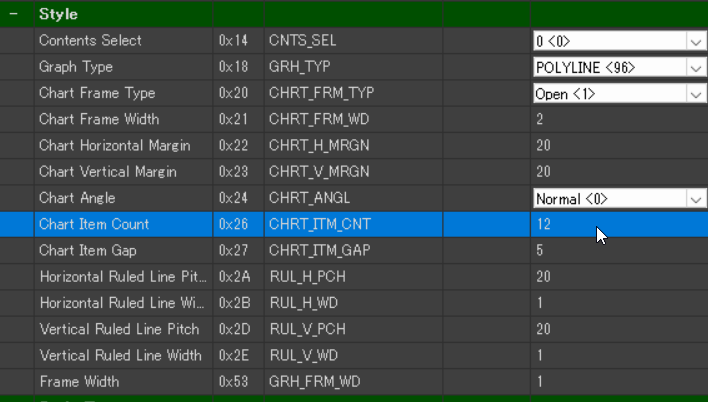
- Graph Type(0x18) → Polyline(96)
- Specifies the type of graph to be displayed. In this case, we use Polyline, which remains unchanged from the default setting.
- Chart Item Count(0x26) → 12
- Determines the number of data points displayed within the graph.
Since we have 12 months of temperature data, we set this value to 12. (Default: 20)
- Determines the number of data points displayed within the graph.
Since our dataset consists of 12 temperature values, Chart Item Count is set to 12. This parameter allows adjustment of how data points are arranged within the graph based on the intended use.
Graph Display Configuration (Style Graph)
- Lane-0 Enable(0x54) → ENABLE(1)
- Enables or disables the display of Chart Lane-0.
- Lane-1 Enable(0x55) → ENABLE(1)
- Enables or disables the display of Chart Lane-1.
By default, these settings are set to ENABLE, meaning both lanes will be displayed in the graph.
Data Registration (Data)
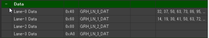
- Lane-0 Data(0x40) → Registers high temperature data
- Stores data values for Chart Lane-0.
- Lane-1 Data(0x60) → Registers low temperature data
- Stores data values for Chart Lane-1.
Up to four data lanes (Lane-0 to Lane-3) can be registered. In this example, the high temperature data is assigned to Lane-0 Data, and the low temperature data is assigned to Lane-1 Data accordingly.
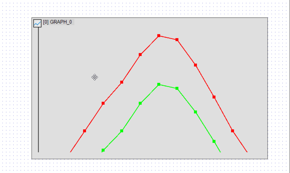
Graph Display Settings and Decorations
The graph tool provides various properties to adjust the display range, value range, and visual decorations such as lines and markers. Below are some examples of modifications that can be applied.
Changing the Number of Data Points
Setting Data Count (0x1B) to 6 will display only the first six registered data points.
Adjusting the Y-Axis Range
- Example: Min. Range → 40, Max. Range → 100
- Data below 40 will not be displayed, and the scale will be adjusted accordingly.
Changing the Marker Shape
Markers (points) can be added to the polyline graph to improve visibility.
- Lane-0 Marker Type(0x94) → Dot (3) (Change to dot)
- Lane-1 Marker Type(0x95) → Cross (2) (Change to cross)
- Lane-0 Marker Size(0x98) → 30 (Adjust marker size, default is 8)
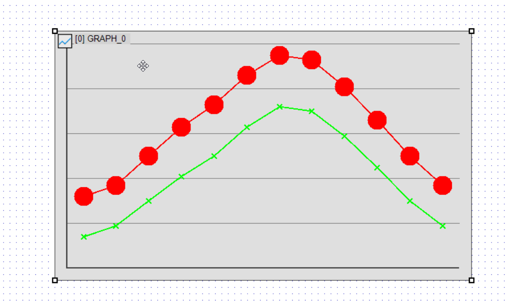
Examples of Marker Types
- Box(1) → Square shape (default value)
- Cross(2) → Cross-shaped line on the graph (orientation changes based on graph angle)
- Dot(3) → Round dot
By changing the marker type, data points become easier to distinguish.
Changing Line and Marker Colors
The color of the polyline graph’s lines and markers can be customized individually.
To modify these settings, use Liner-0 Color and Liner-0 Marker Color.
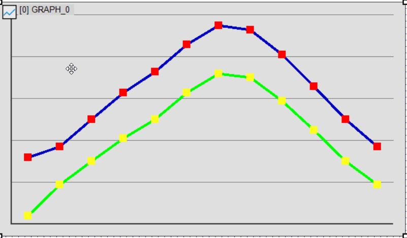
Example of Color Changes
- Line-0 Color(0x70) → Change line color to blue
- Modifies the line color for Chart Lane-0.
- Line-1 Maker Color(0x9D) → Change marker color to yellow
- Adjusts the marker color for Chart Lane-1.
By modifying the markers and line decorations, you can create a graph with improved visibility. Try adjusting the values as needed to achieve the desired appearance.
DownloadDownload sample project & program (for GT Design Studio & Arduino)
Conclusion
In this article, we demonstrated how to use the GT-SP polyline graph to display monthly high and low temperatures. We covered the basics of data registration, adjusting the Y-axis scale, and customizing marker decorations to enhance graph readability.
In the next article, we will explore how to create other types of graphs available in the tool.